Letterpress font for new CD front cover
The front cover artwork for ‘The Tumbling of Creatures’ uses unique metal block fonts from the letterpress studio of Graham Bignell, the New North Press, in East London www.new-north-press.co.uk.

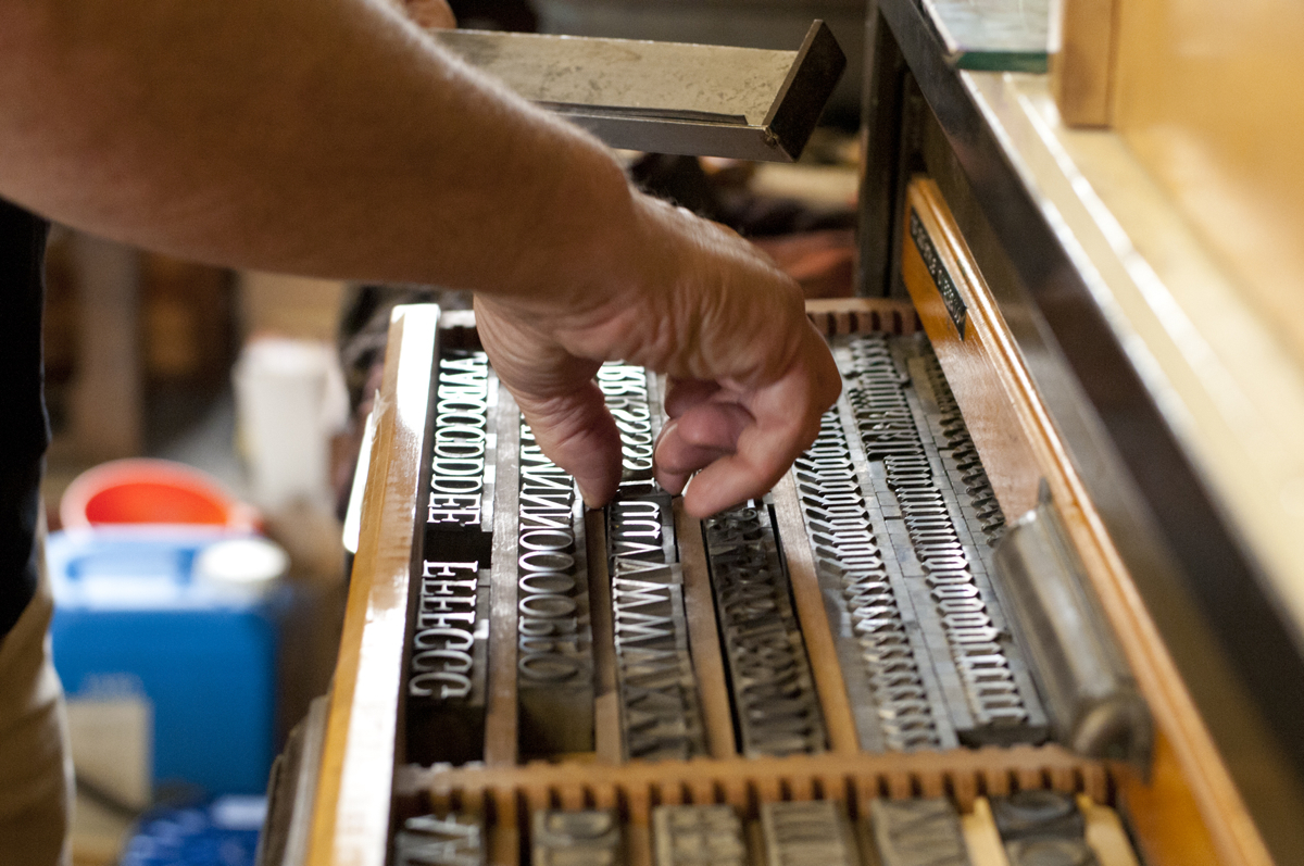
60pt Grotius type was used for the alphabet. This font was designed by Sjoerd Hendrik de Roos (1877 – 1966) at the Amsterdam Type Foundry. The italic is an unknown font.
The majority of the type has been obtained from old printers’ stock and some type faces date from 1820.
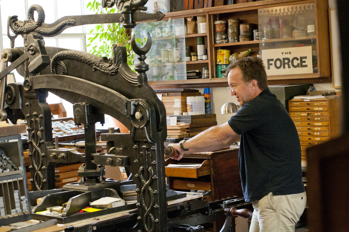
This Columbian Press came from a printer in Kent and dates from the 1850’s.
Most larger types are stored alphabetically in the case upside down, running from left to right, so that when printed they appear the right way round. The expression “mind your p’s and q’s” comes from the letterpress where all the characters are reversed.